Summary:
Adapting is a podcast that highlights persons with disabilities within the Medicine Hat community. Our guests are given a judgment free platform to talk about their stories and their experiences in adapting to everyday life. Our hosts Robin and Kirah discuss their experiences with the guests to provide a unique, but relatable perspective. This podcast was possible thanks to Telus Storyhive and will be available through the Storyhive Youtube channel or on demand with Telus Optik TV.
Design Work:
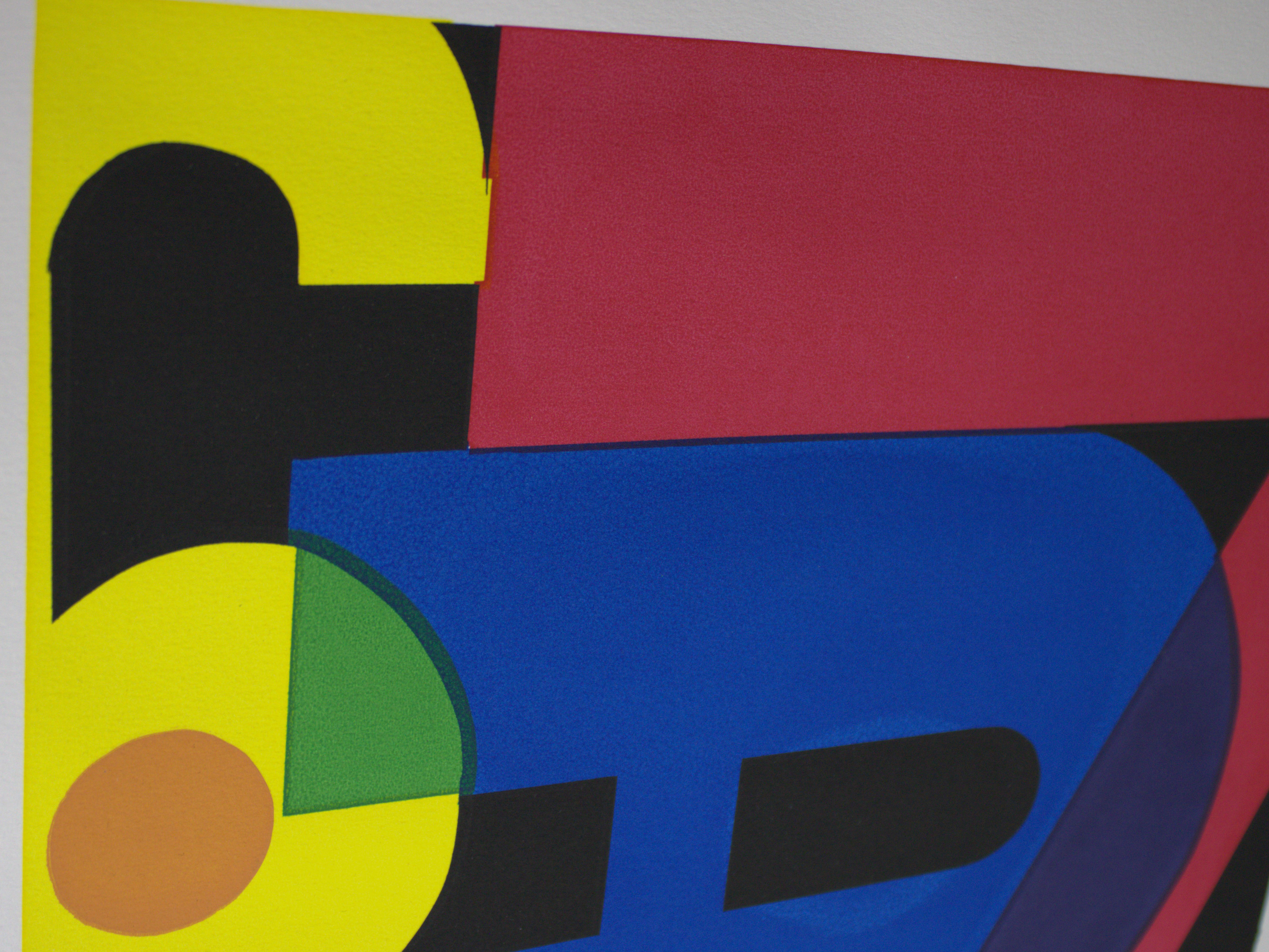
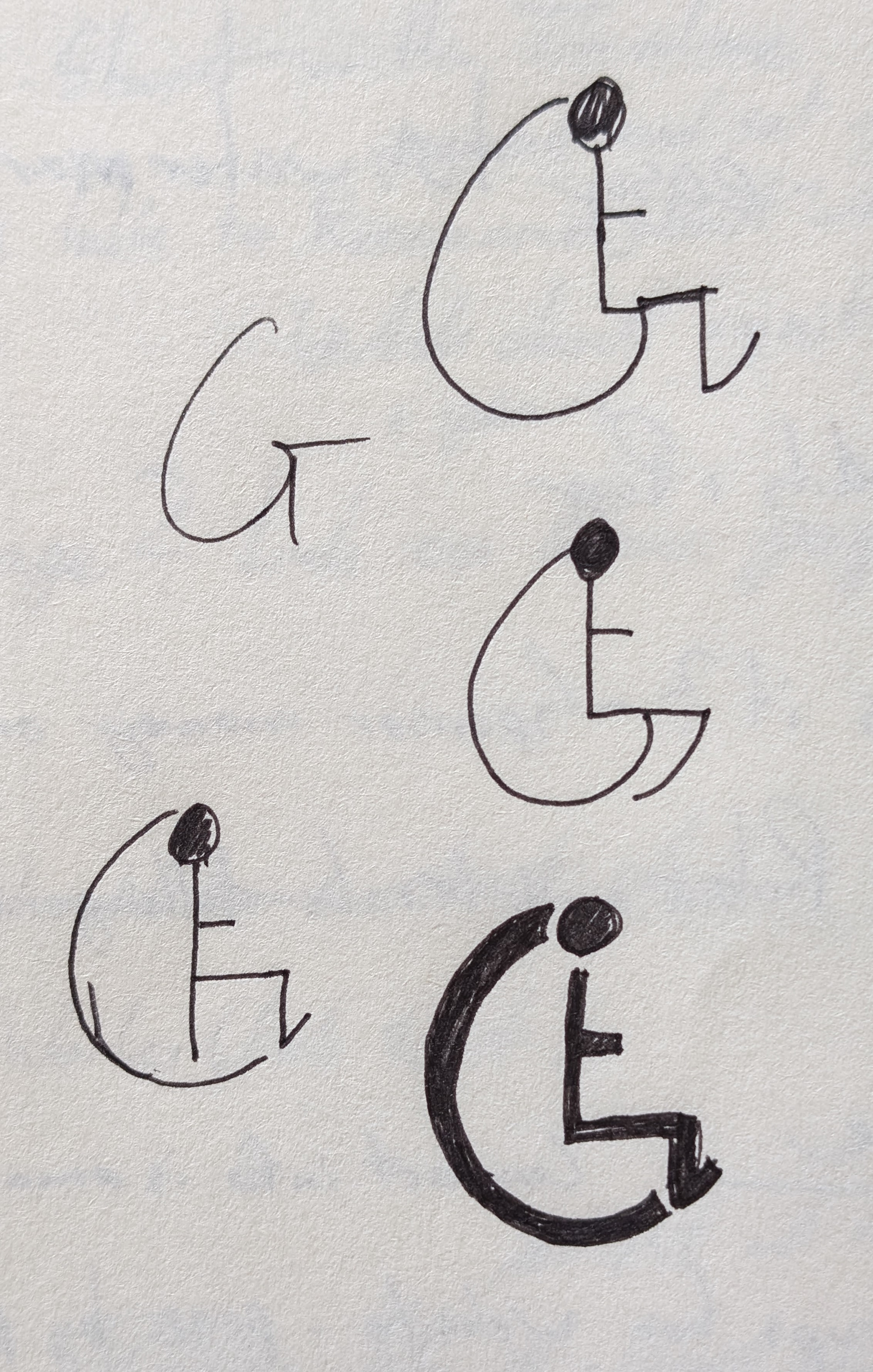
Dalton Ehry, the producer, has been passionate about this podcast from the start and came to me with a few ideas for the overall design, mood, and pacing of this project. I wanted to do my best to help his vision come to life with the skills I have so far. His vision for the logo was simple but effective, ADAPTING, but the G was replaced with the wheelchair symbol.
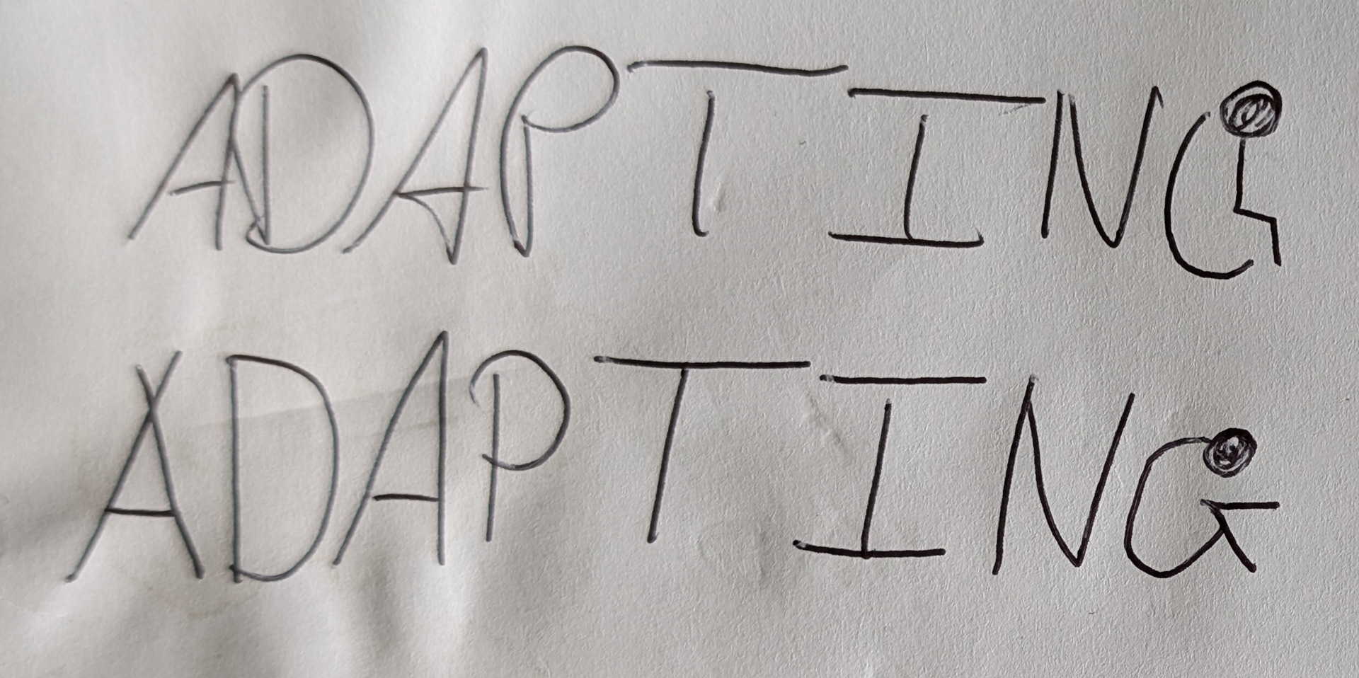
I immediately loved the idea, but thought it could be pushed further to also identify the community the show takes place in. Medicine Hat is known for having the “World’s Tallest Teepee” so I wanted to include it somewhere in the logo. Naturally, I thought A would be a perfect fit and decided to have a symbol at the start of the word and one at the end. This would make for a logo that is simple but descriptive, and allows for an easy animation to introduce the podcast. With this idea in mind, I took to Illustrator and came up with an idea:
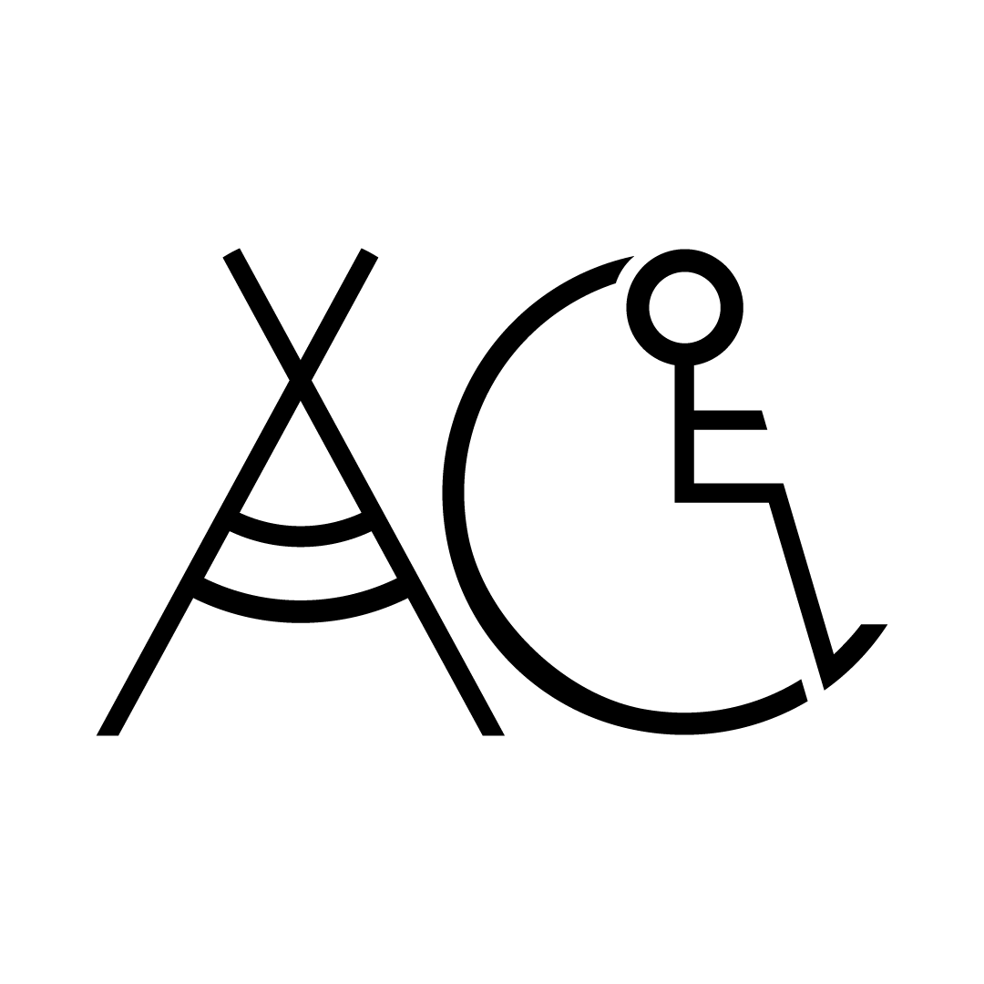

I loved the look of the logo, but after about 3 seconds of looking at it, I decided it conveyed the wrong message. Instead of being the recognizable “World’s Tallest Teepee”, It was simply just a teepee next to the wheelchair symbol. To Dalton and I, it looked more like a logo for a show about awareness for Aboriginal peoples with disabilities, although this is an important message, it was not what we were going for. It’s always disappointing when an idea doesn’t work the way you want it to, but it’s important to know when to let the bad ideas go, so I stuck with his original idea and came up with a few more iterations.


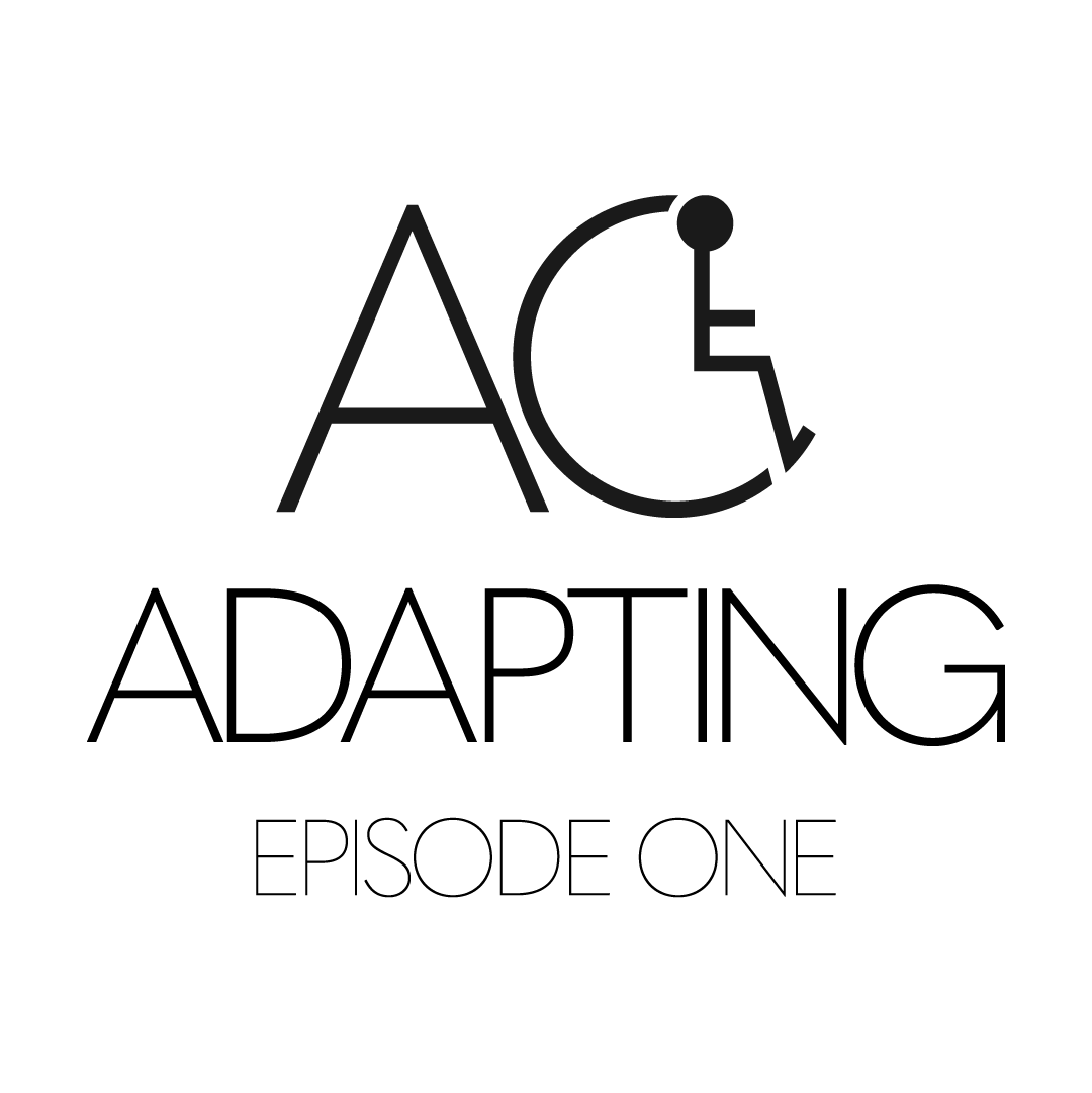
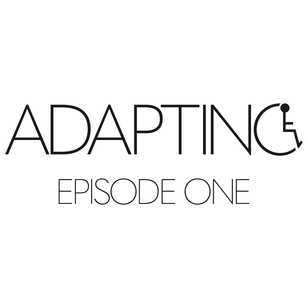
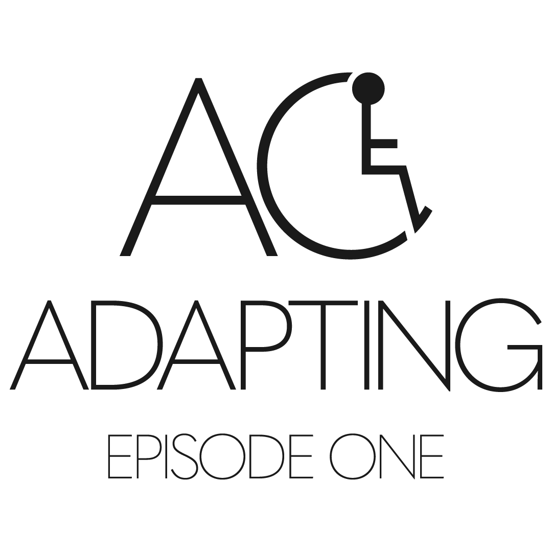
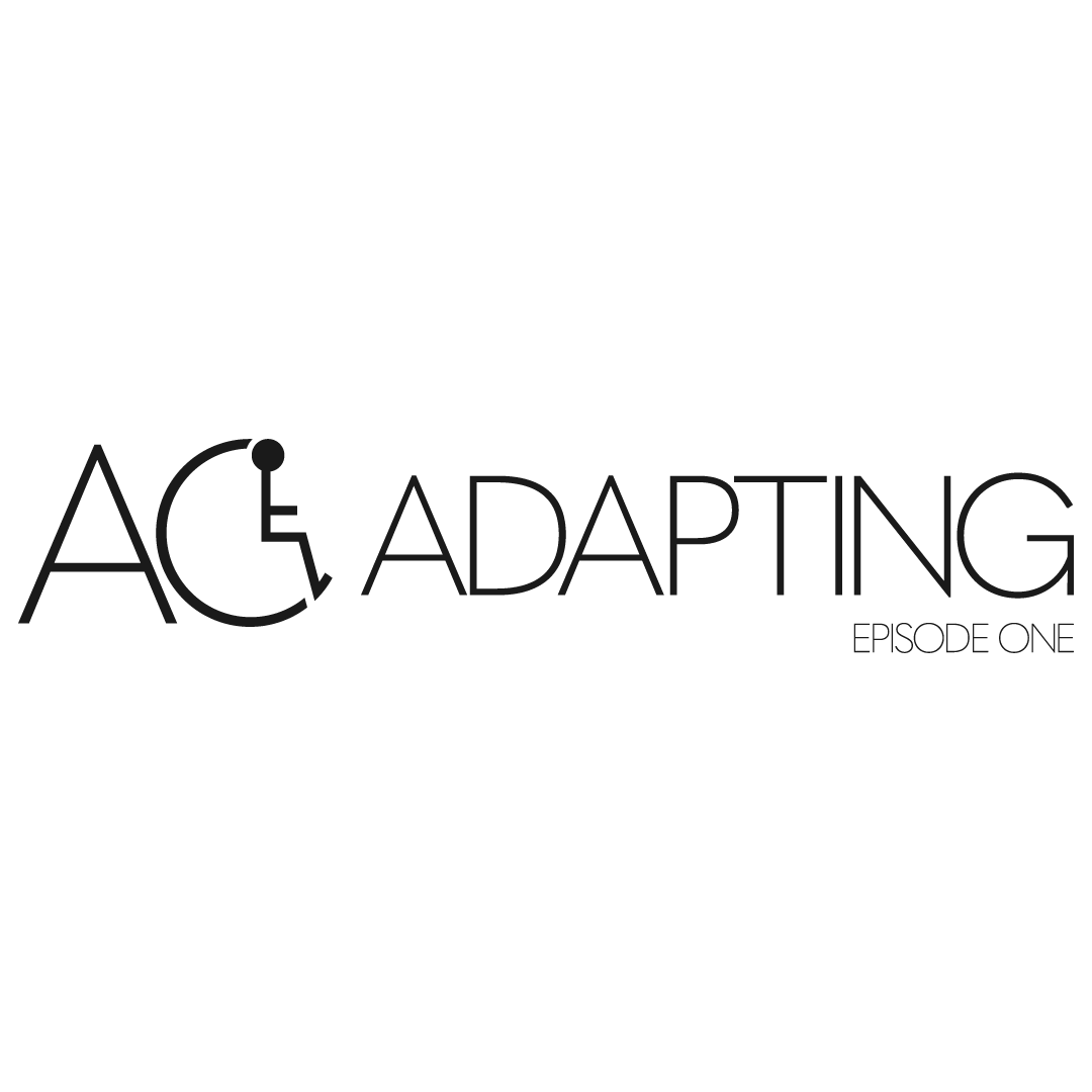
After talking with Dalton, we settled on these as the final logos to use:
Motion Design:
To create a more engaging show (and to get a little more practice in After Effects) I created my own title card, nameplate, transition, and closing card animations for the podcast.
The idea for the expanding logo was inspired by “Adventures In Golf”, a show Dalton recommended for guidance on his vision. I also thought it was a good fit for our show because it represents moving forward, and spreading the word of ADAPTING literally and figuratively.
Responsibility:
Although I had a brief appearance on the introduction episode of the podcast and introduced myself as “The Cameraman”, my responsibilities were so much more. Lead Designer was my biggest role at the start, but once the logo was finished it took a back seat to the other roles. My other roles included; Camera Operator, Lighting Technician, Audio Engineer, and Lead Editor. This diversity in roles is stressful, but it allows for a lot of practice in real world scenarios.
Editing is the hardest, but most rewarding part of this project. Cutting together all the camera angles and audio to tell a cohesive story is time consuming, but seeing it all come together is satisfying. Before we could really get rolling in production an approval episode had to be submitted. This episode took me a few weeks to finish because it was the first actual episode and it would establish the baseline for all the other episodes. With the approval cut I was essentially shaking off the editing rust I had gathered and relearning a few things to speed up my process. On top of relearning some things in Premiere Pro, I was also teaching myself new things in After Effects. Once the approval cut was finished, I had a baseline to strive for in the remaining episodes, and I had my templates made for the animations to hasten up the process. I also quickly established a priority list during editing to increase my efficiency which has made editing 2 episodes a month much easier.
